Display
Settings > Display is where BookOrbit stops treating every library like the same shelf. Use it to decide whether appearance follows you between devices, how covers are framed, how dense grids feel, and what a click on a book cover should do.
The page is split into four tabs: Theme, Book Covers, Layout, and Behavior.
Preference Storage
The first choice on the Theme tab decides where BookOrbit saves theme preferences and most display preferences.
| Mode | Behavior |
|---|---|
| This device only | Theme, cover, layout, thumbnail-click, and Smart Scope preview preferences stay in this browser's local storage. Use this when a laptop, tablet, or wall display should keep its own look. |
| My account | Those same preferences are saved to your BookOrbit account and loaded after sign-in. Use this when every browser should pick up the same theme, cover treatment, layout defaults, and browsing behavior. |
When account sync is turned on for the first time, BookOrbit seeds the server with the current local preferences if no saved row exists. If saved account preferences already exist, it loads those instead. Demo-restricted accounts cannot enable account sync.
Per-view cover sizes are the one exception to remember: when Per-view sizes is selected, the individual size and spacing values for each library, collection, or Smart Scope are stored in that browser. The setting that chooses per-view mode can sync to the account, but the per-view measurements themselves are local.
Series collapse is stored separately with your user account, because it changes how library and collection grids group books rather than how the interface looks.
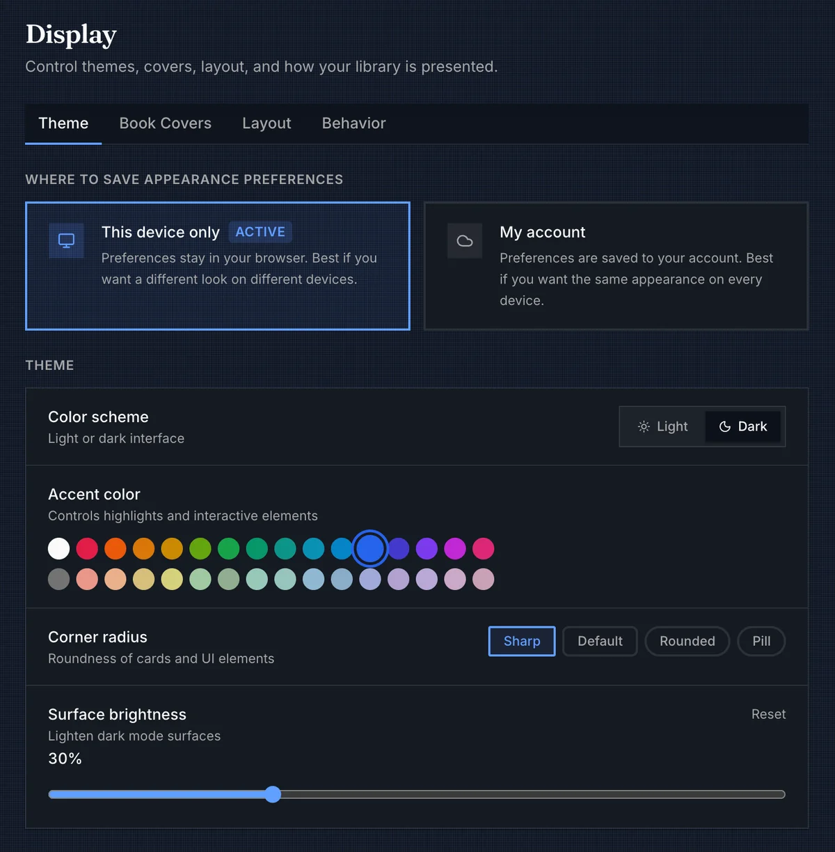
Theme
Theme settings apply immediately. There is no save button.
| Setting | What it changes |
|---|---|
| Color scheme | Switches the app between light and dark mode. |
| Accent color | Controls interactive highlights such as selected tabs, sliders, focus rings, active buttons, and primary actions. |
| Corner radius | Changes the roundness of cards and common UI controls. Options are Sharp, Default, Rounded, and Pill. |
| Surface brightness | Lightens dark-mode surfaces from 0% to 100% in 5-point steps. It appears only in dark mode. |
Accent colors are grouped visually into vivid and pastel rows. Background patterns are separate from accent color: the accent changes interaction color, while the background changes the texture behind the app content.
Library Background
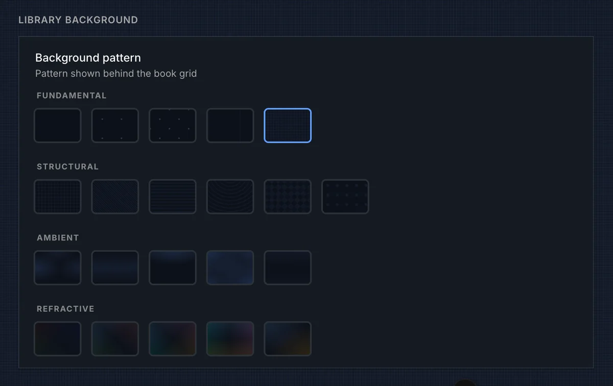
The background picker controls the pattern shown behind the main app surface. It is most obvious around book grids and settings pages, and quieter behind dense content like tables.
| Group | Patterns |
|---|---|
| Fundamental | None, Dots, Cross, Terminal, Millimeter |
| Structural | Blueprint, Brushed, Scanlines, Vinyl, Carbon, Perforated |
| Ambient | Aurora, Horizon, Glow, Mesh, Elevation |
| Refractive | Prism, Spectrum, Spectrum X, Spectrum Plus, Eclipse |
Choose None for the least visual noise. The structural patterns are useful when you want texture without changing the personality of the whole interface.
Book Covers
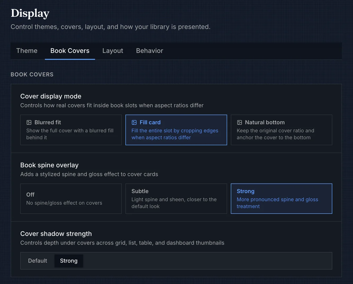
Cover settings decide how much BookOrbit should normalize a mixed library. They apply across the places where book covers appear, including grids, lists, tables, the dashboard, recommendations, and book details where the component supports the same cover surface.
| Setting | Options | Behavior |
|---|---|---|
| Cover display mode | Blurred fit, Fill card, Natural bottom | Chooses how real cover artwork fits into a fixed book slot when the aspect ratio differs. |
| Book spine overlay | Off, Subtle, Strong | Adds a stylized spine and gloss layer to book cover cards. Audio-aware cards can suppress this treatment for audiobook covers. |
| Cover shadow strength | Default, Strong | Changes the depth under covers across grid, list, table, and dashboard thumbnails. |
Blurred fit keeps the full cover visible and fills the leftover space with a blurred backdrop. Fill card crops edges so the artwork fills the whole slot. Natural bottom keeps the original ratio and anchors the cover to the bottom, which can make tall and narrow covers feel less stretched.
Card Overlays
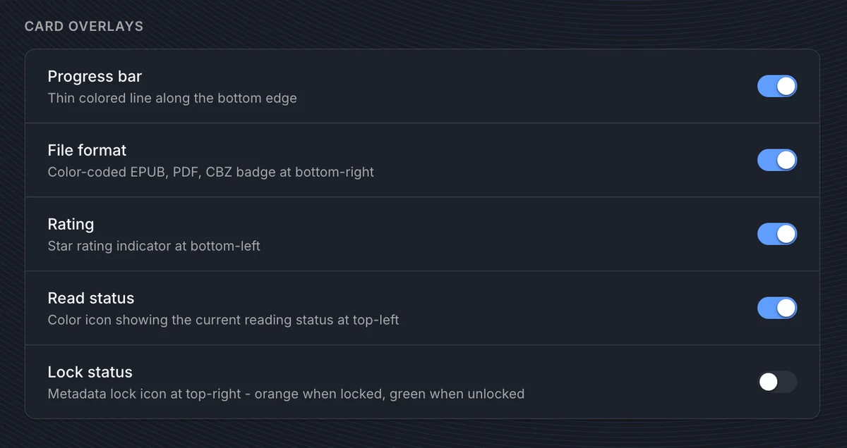
Overlays put small signals directly on book cards so you can scan a shelf without opening every book.
| Overlay | Where it appears | Shown when |
|---|---|---|
| Progress bar | Bottom edge | A book card has reading progress above 0%. A non-Stack collapsed series card uses the same overlay to show series completion. |
| File format | Bottom-right | The book has a primary readable file format, such as EPUB, PDF, CBZ, or M4B. |
| Rating | Bottom-left | The book has a personal rating. |
| Read status | Top-left | The book has a reading status other than Unread. |
| Series number | Top-right | The book has a series index, is not missing, and the grid is not in selection mode. |
| Lock status | Top-right | The book is not missing and selection mode is off. Orange means locked; green means unlocked. |
The default overlay set is Progress bar, File format, Rating, Read status, and Series number. Lock status is available but off by default.
Book-card overlays are hidden while selecting books. Collapsed series cards only show the series progress bar when Progress bar is enabled and the collapsed-series cover mode is not Stack.
Layout
Layout settings control the geometry of browsing surfaces: how large covers are, how much space sits between them, and whether grid cards carry text outside the image.
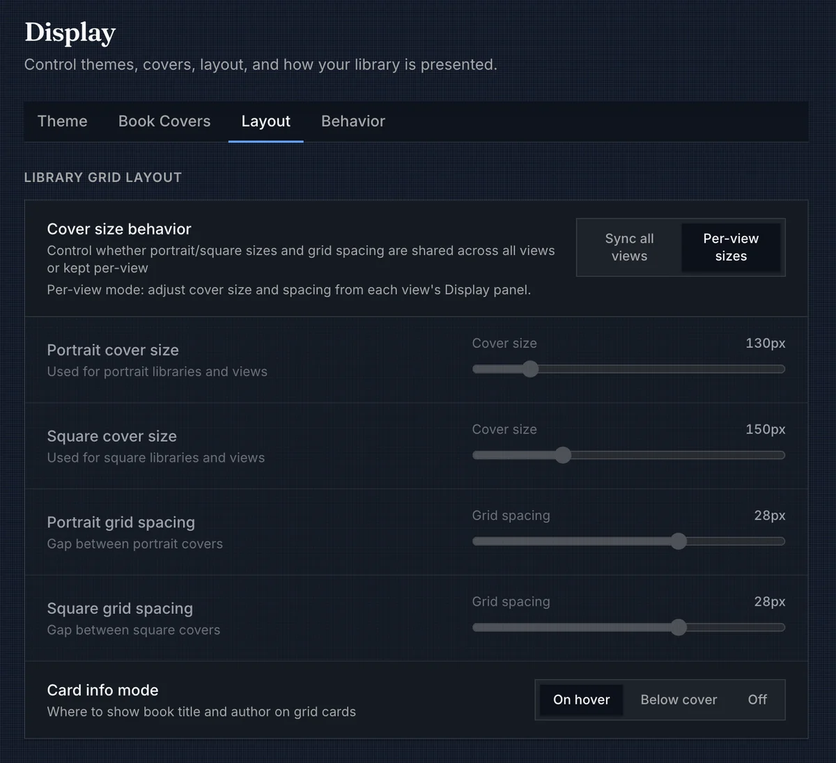
Library Grid Layout
| Setting | Options / range | Behavior |
|---|---|---|
| Cover size behavior | Sync all views, Per-view sizes | Chooses whether cover size and spacing are shared or adjusted separately per view. |
| Portrait cover size | 100px to 280px | Shared cover width for portrait-cover libraries and views when synced mode is active. |
| Square cover size | 100px to 280px | Shared cover width for square-cover libraries and views when synced mode is active. |
| Portrait grid spacing | 4px to 40px | Gap between portrait book cards when synced mode is active. |
| Square grid spacing | 4px to 40px | Gap between square book cards when synced mode is active. |
| Card info mode | On hover, Below cover, Off | Chooses where title and author information appears on grid cards. |
In Sync all views, changing size or spacing from the Display panel in a library, collection, or Smart Scope updates the shared portrait or square values. In Per-view sizes, each of those views keeps its own cover size and spacing, adjusted from that view's Display panel.
When Card info mode is Below cover, two extra selectors appear: Primary card label and Secondary card label. Each can show Hidden, Book title, Series title, Series title + position, or Author.
Series, Authors, Lists, and Tables
The bottom of the Layout tab covers the surfaces that do not behave like ordinary book cards.
| Setting | Options / range | Behavior |
|---|---|---|
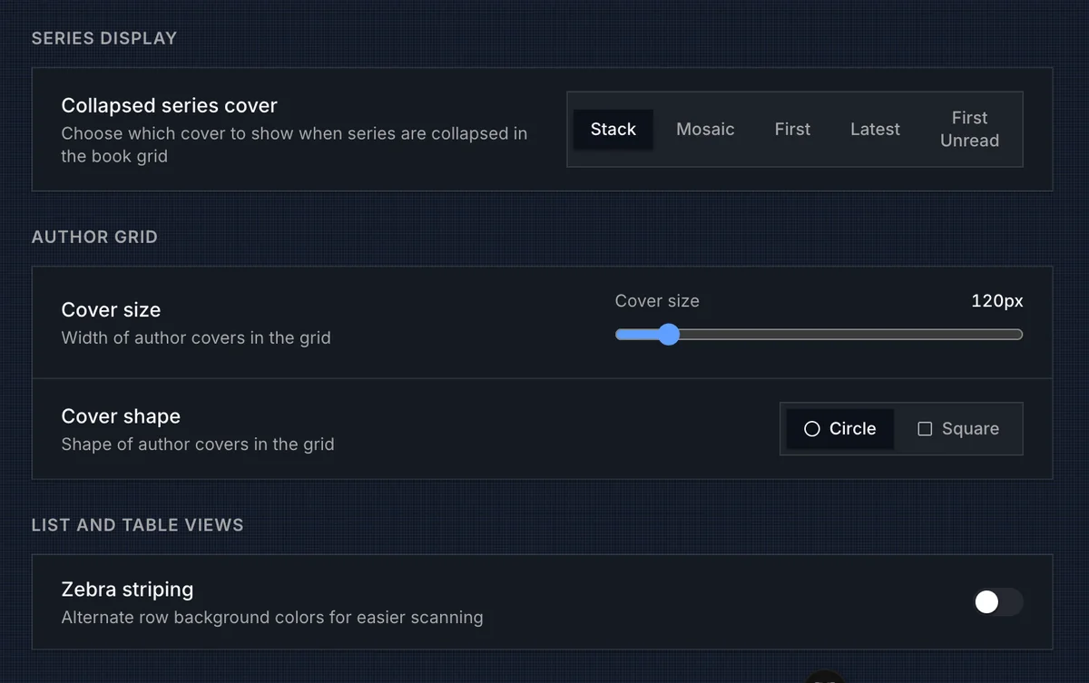
| Collapsed series cover | Stack, Mosaic, First, Latest, First Unread | Chooses what image represents a collapsed series card. |
| Author cover size | 100px to 280px | Sets the width used by author cards in the Authors grid. |
| Author cover shape | Circle, Square | Chooses whether author images render as circular portraits or square/portrait cards. |
| Zebra striping | On, Off | Alternates row backgrounds in table views for easier scanning. |
Collapsed series cards are still series cards. The cover mode changes how the series is represented: Stack shows up to three covers, Mosaic shows up to four, First uses the first volume cover, Latest uses the latest volume cover, and First Unread prefers the first unread volume before falling back to the first available cover.
Table-specific density, columns, presets, and saved views stay in the table display panel. See Table View for those controls.
The Authors page also has a header Display panel for author cover size, author cover shape, and grid gap. The Series index has its own header Display panel for series-card width and grid gap; those values are stored in this browser and are separate from the book-grid cover sizes above.
Author detail and series detail pages reuse the shared portrait-cover size and grid spacing for their book grids, with the series detail grid deriving a slightly smaller in-series cover size from that shared value.
Behavior
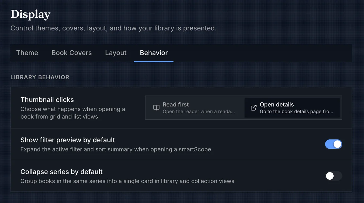
The Behavior tab decides what happens after the shelf is on screen.
| Setting | Options | Behavior |
|---|---|---|
| Thumbnail clicks | Read first, Open details | Controls the primary click target for book cards and list rows. |
| Show filter preview by default | On, Off | Expands the active filter and sort summary when opening a Smart Scope. |
| Collapse series by default | On, Off | Sets the global default for grouping books in the same series into one card in library and collection views. |
Read first keeps the fast browsing path: desktop grid cards open the primary readable file when one exists, touch grid cards reveal the card overlay first, and list rows open Quick View. Open details sends grid-card and list-row clicks to the book details page instead. Selection mode overrides both options.
Series collapse can be changed globally here, then overridden inside a specific library or collection. Effective behavior resolves in this order:
- Collection override, when one exists.
- Library override, when one exists.
- Global default from Settings > Display > Behavior.
Use collapse when a long series is taking over a grid. Leave it off when you want every volume to stand on its own.